Redesigning the movie page for Smart TV
- Company Yandex
- Timeline Winter 2023
-
Fields
- Smart TV OS
- Voice User Interface
- B2C, TV Streaming
- My role Senior Product Designer
-
Responsibilities
- Feature Scoping
- Research
- Prototyping
- Interaction & Visual Design
- Motion Design
Yandex TV
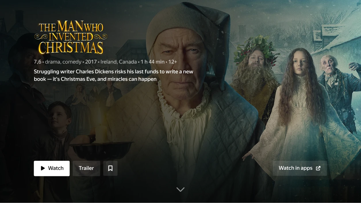
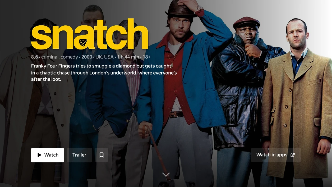
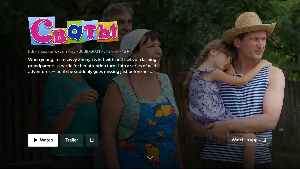
Yandex TV is a Russian smart TV operating system based on Android. For the first few years, it was only shipped on budget TVs made by third-party manufacturers.
But in 2023, Yandex launched its first self-branded TVs — higher-quality devices in a more premium segment.
To match the launch of these new devices, our team was tasked with updating the interface to feel just as modern and high-performance as the hardware. My focus was on redesigning one of the most important parts of the system: the movie/series page.
The Challenge
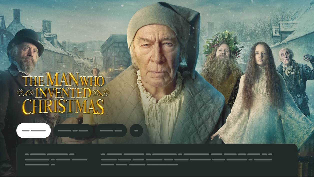
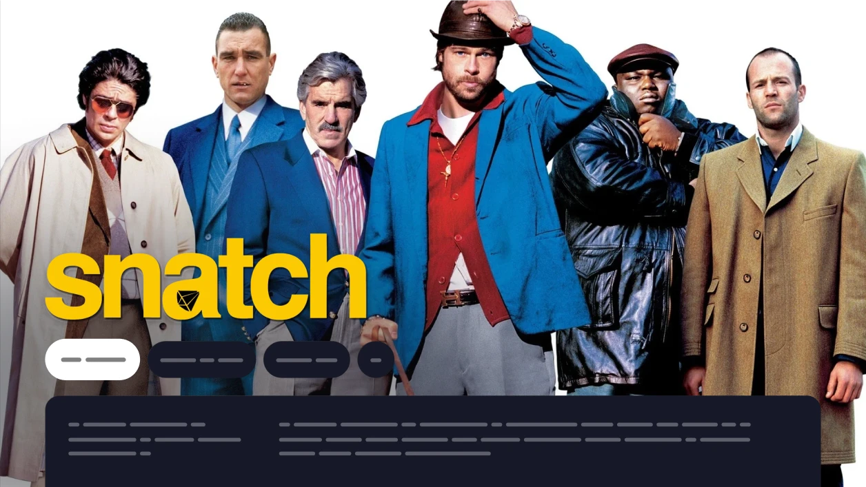
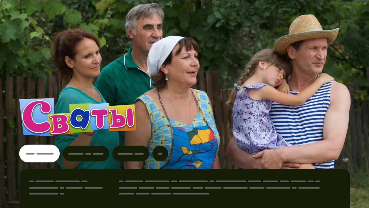
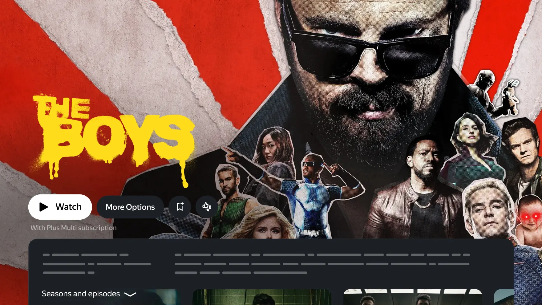
The old design had its fair share of issues. It looked a bit dated and, more importantly, didn’t play nicely with all poster types. Our content team couldn’t always rework artwork to fit the right-aligned layout, which often led to large parts of posters getting lost under gradients, text, or logos.
The same thing happened with autoplaying trailers — a feature we had just launched—where nearly half the video ended up hidden behind the interface.
The page felt cluttered and didn’t really encourage users to explore. It doesn’t seem scrollable at a glance, the rating (a super important factor when choosing what to watch) was barely noticeable, and the button block often turned into an infinite button’ graveyard.
We set out to simplify things, keep what mattered, and give the content more breathing room.
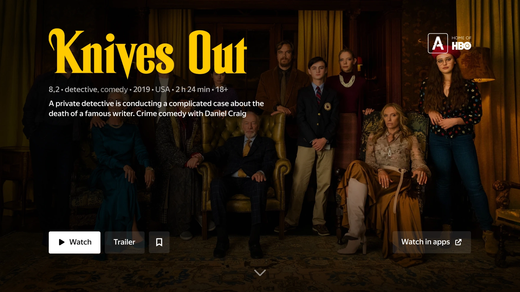
The First Screen
The top of the page is super important—less than 10% of users ever scroll past it. So it had to do all the heavy lifting when it came to helping someone decide what to watch.
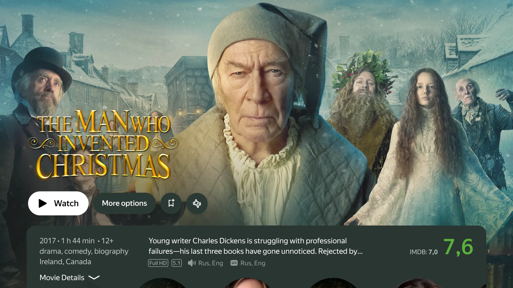
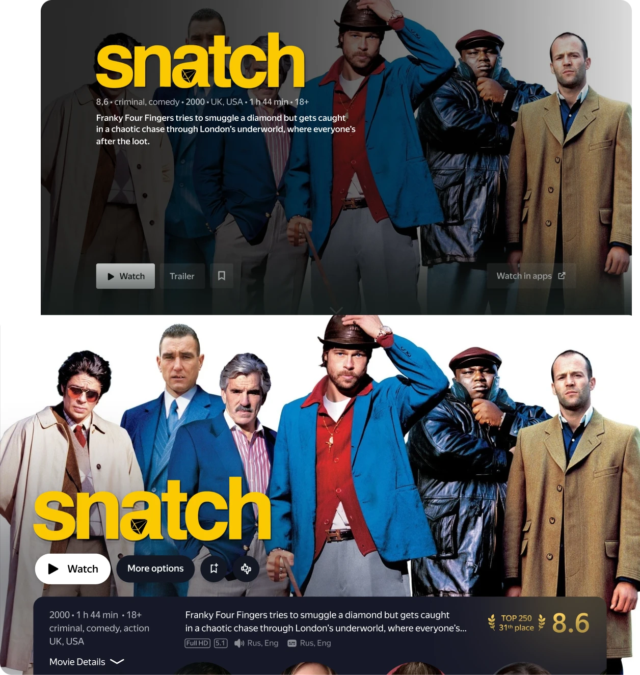
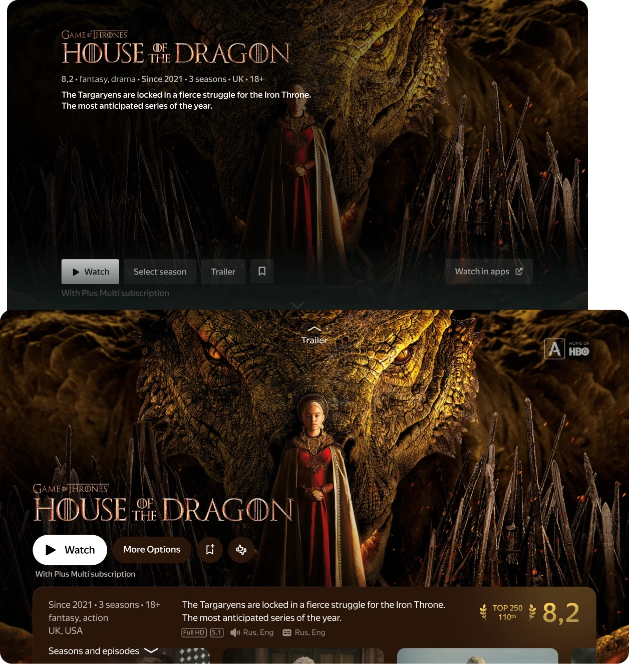
First step: make the content shine. I gave the poster and logo more breathing room and even tinted the interface based on the poster's dominant color to make it feel more immersive.
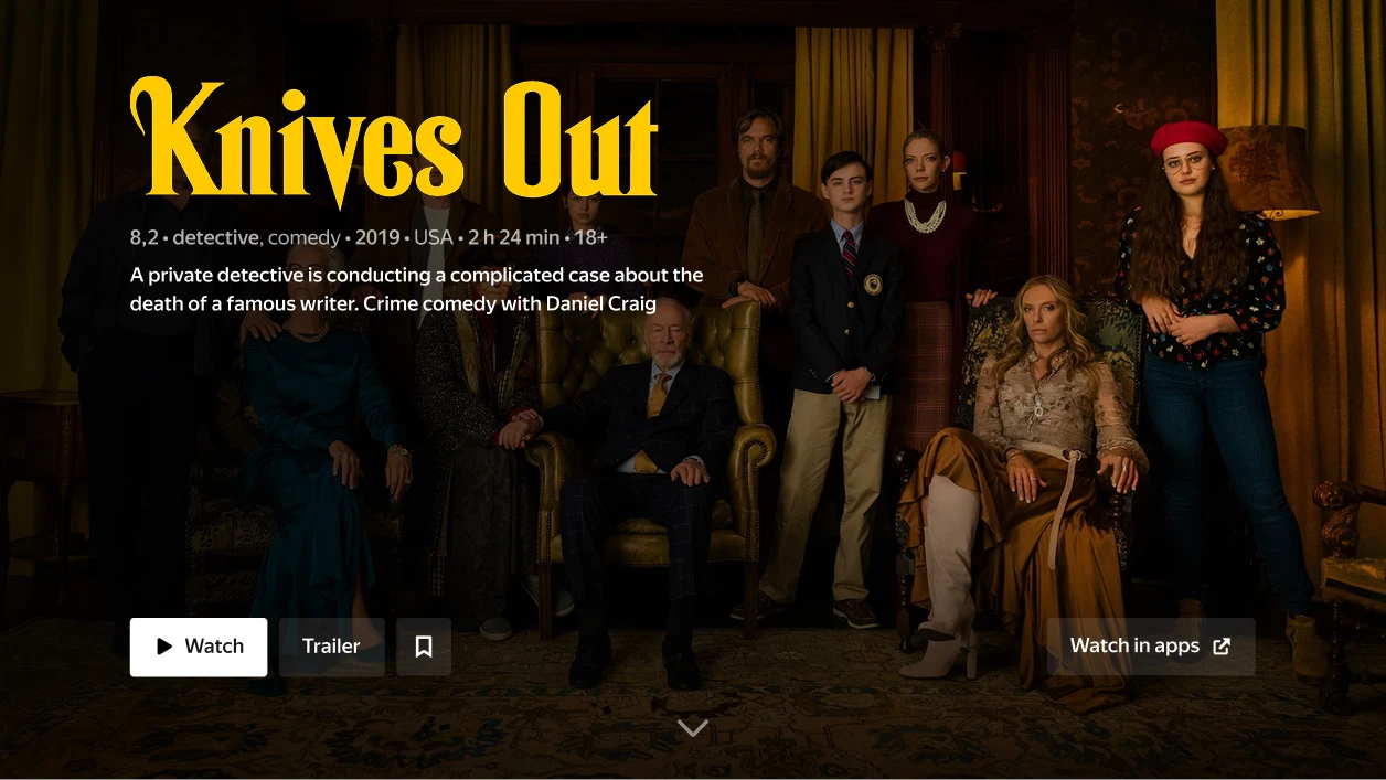
Then I moved on to the UI blocks, starting with the most overloaded one: the buttons — which had grown significantly since the product first launched.
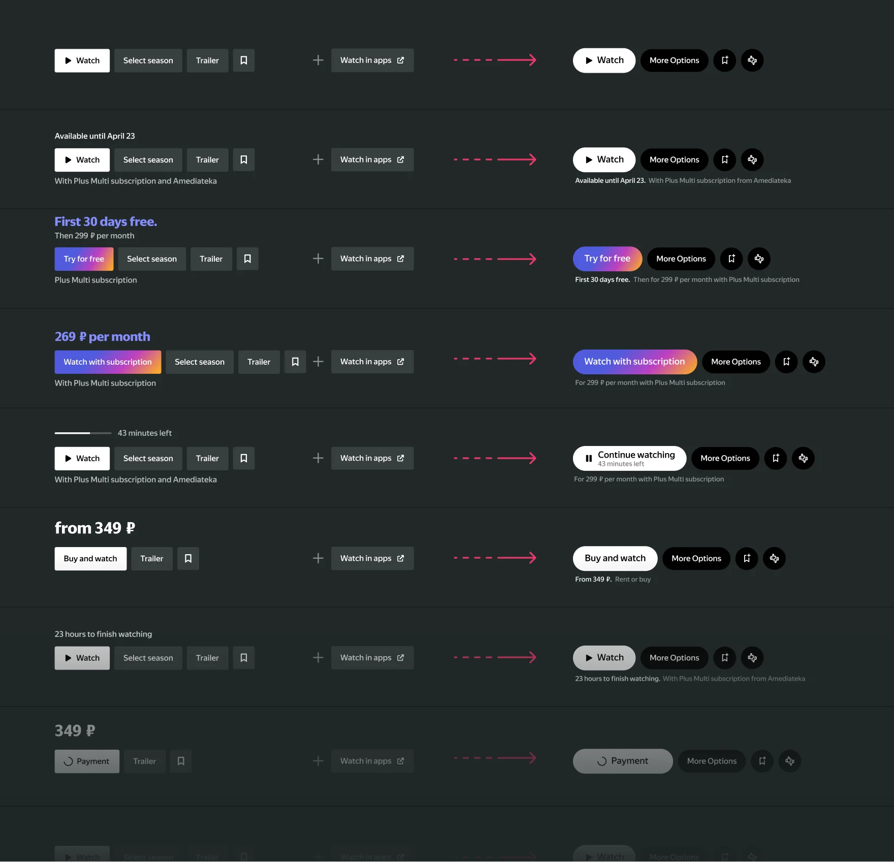
Since trailers were now autoplaying in the background, I removed the trailer button first of all and replaced it with a small animated arrow that, when clicked up, clears the UI and plays the trailer fullscreen.
I did the same with the "Seasons & Episodes" button for series. Instead of cluttering the button area, that section now appears naturally as users scroll, making the page feel more open and scrollable.
Previously, the “episode navigator” lived on a subpage. Now that I moved it up, it was the perfect time to redesign that too.
We couldn’t stick with the “standard layout” (seasons on the left, episodes on the right) because we needed to keep upward navigation back to the top screen.
So I invented a simple, but really cool "click-skipping" mechanic
Works elegant: one tap on the remote takes you straight to the section, but going back requires pressing up twice — once to reach the mini filter/navigation layer, and again to return to the top.
It preserved the idea of keeping primary navigation vertical and everything extra — like filters and episode browsing — horizontal.
Going back to the button list, I also added a small rating button that expands into two options: rate the title or choose not to recommend it.
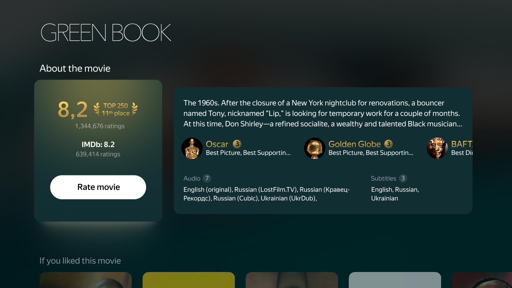
When I finished with the buttons, I moved on to the supporting blocks — description, specs, rating, etc.
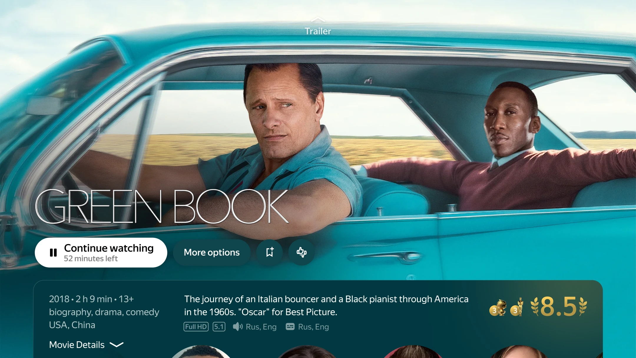
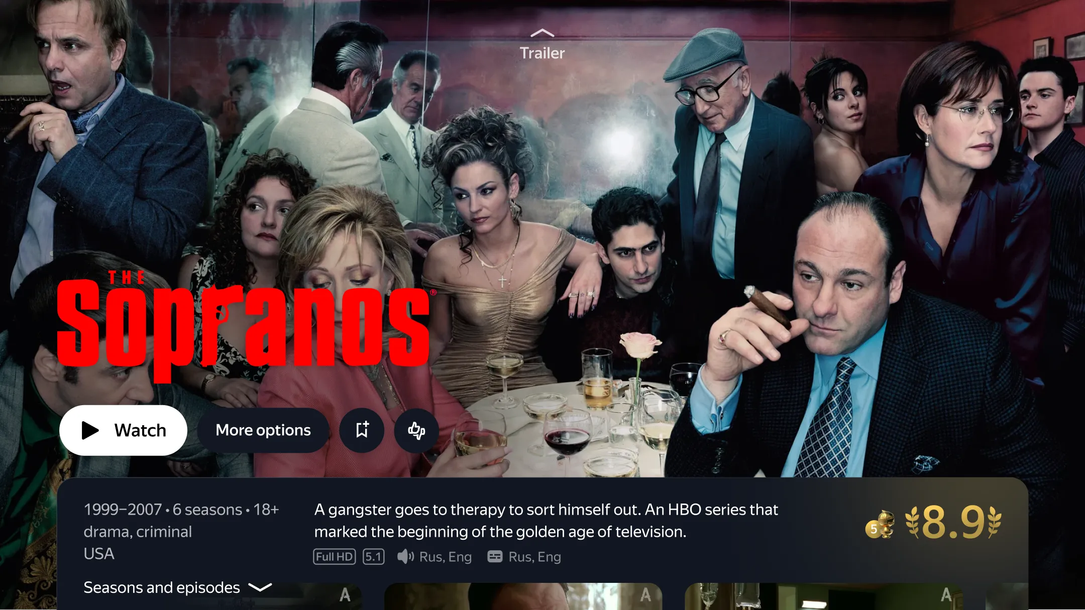
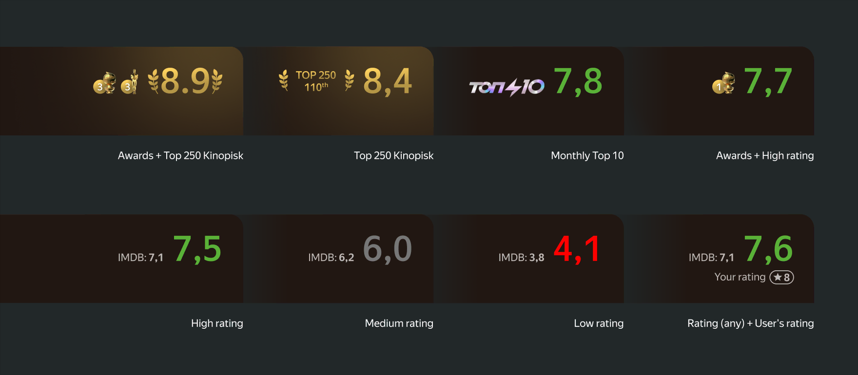
I paid extra attention to the rating block. In Russia, Kinopoisk is a well-known and trusted platform — kind of like the local IMDb — and people rely on its scores a lot when deciding what to watch.
To make that more helpful, I gave the rating more space and designed a few layout variations depending on whether the title had a high score, made it into top lists, or won awards.
In the end, the top of the page became much cleaner and easier to use, bringing key info front and center and letting the content speak for itself.
As for the rest of the page? The main engagement hooks were already in place: episodes and seasons for shows, cast for movies.
All the Rest
After trailers and ratings, the crew and cast is the third most important thing people check while deciding what to watch.
So I gave this carousel a refresh to match the new visual language and finally added the long-awaited "top crew" section. Since we already sync that info with Kinopoisk, it was easy to plug in.
Next up: the detailed film info section. I reused the rating block here, made it bigger, and added a clear, easy-to-spot rating button. On the left side, I added a section with full movie details that opens in a full-screen popover.
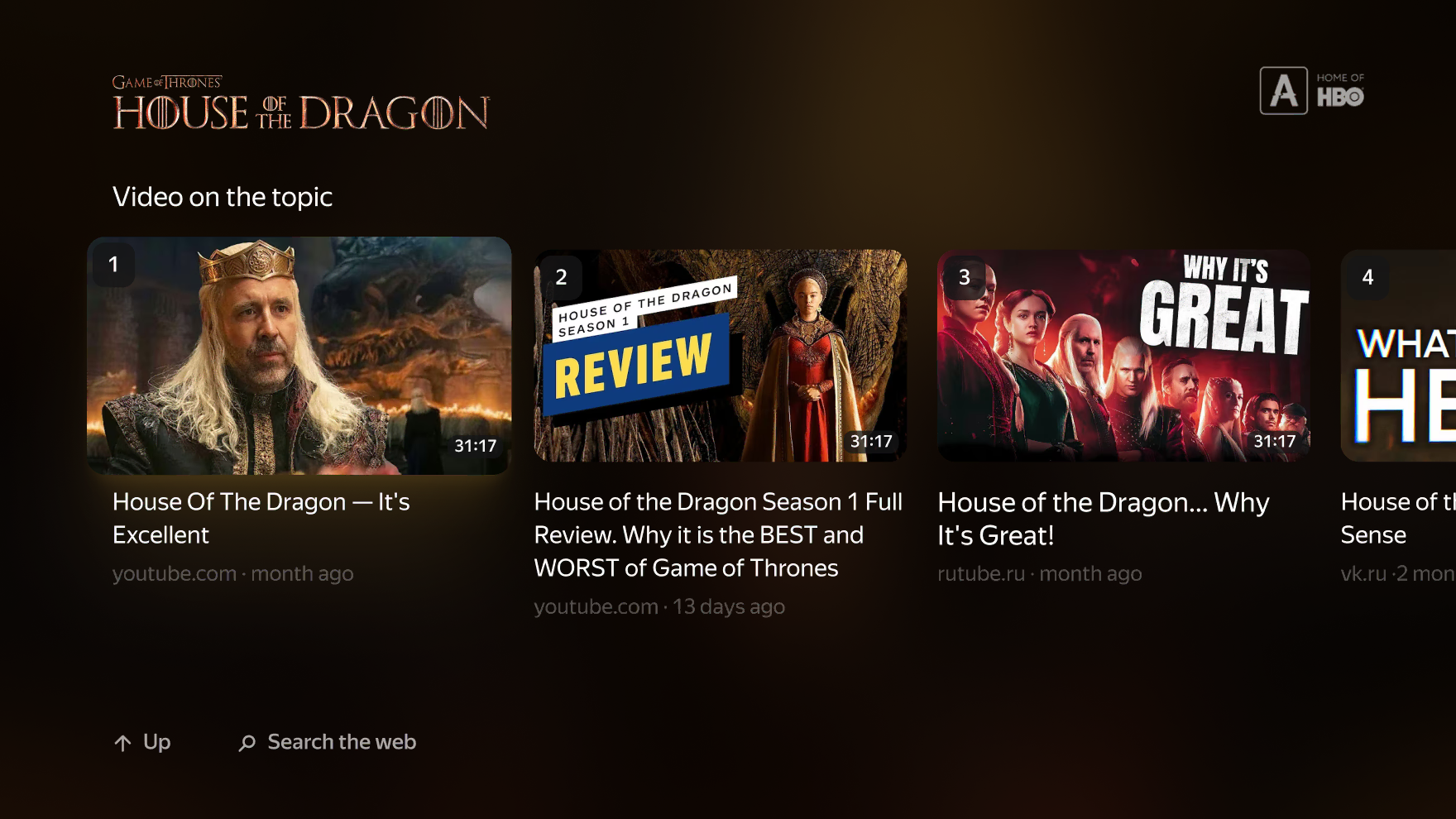
Since Yandex TV is a full operating system — not just an app — we can also run third-party apps. So at the very end of the page, I added a smart carousel that pulls in web videos related to the title — perfect for users who love watching reviews, breakdowns, or extras about the movie they’ve just watched.
I also finished and tidied up a few more different UI elements to keep everything consistent.
User Testing & Results
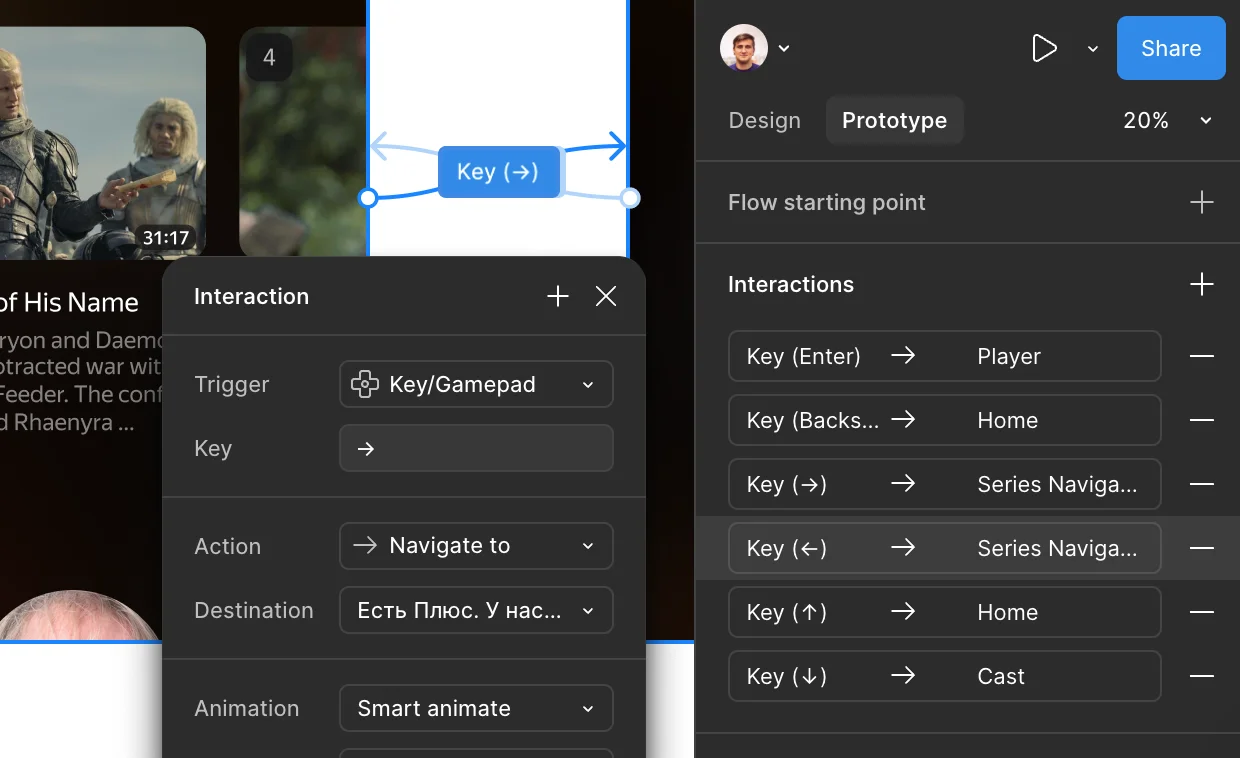
To see how the new movie page worked in practice, we ran a few user interviews. I built Figma prototypes and set them up for keyboard control — arrow keys, Enter, Backspace — to mimic a real TV remote. Then we hooked up a remote and TV in our UX lab and invited people in to try it out.
We showed them both the old and new versions (in different orders) and asked them to complete the same tasks on each.
The feedback was great: users found the new layout easier to navigate and more modern. They liked how the content stood out more and appreciated the cleaner, more focused design.
Later I handed everything off for development in phases — but due to shifting priorities, the update didn’t make it in time for the new TV launch. And by then, I had already moved on from Yandex to join Platinumlist.