Improving sales funnel through ticket flow
- Company Platinumlist
- Timeline Fall 2023–Summer 2024
-
Fields
- Website
- Coversion rate
- B2C, Ticketing platform
- My role Product Lead Designer
-
Responsibilities
- Feature Scoping
- Research
- Prototyping
- Interaction & Visual Design
- Systematization
- Team Leading
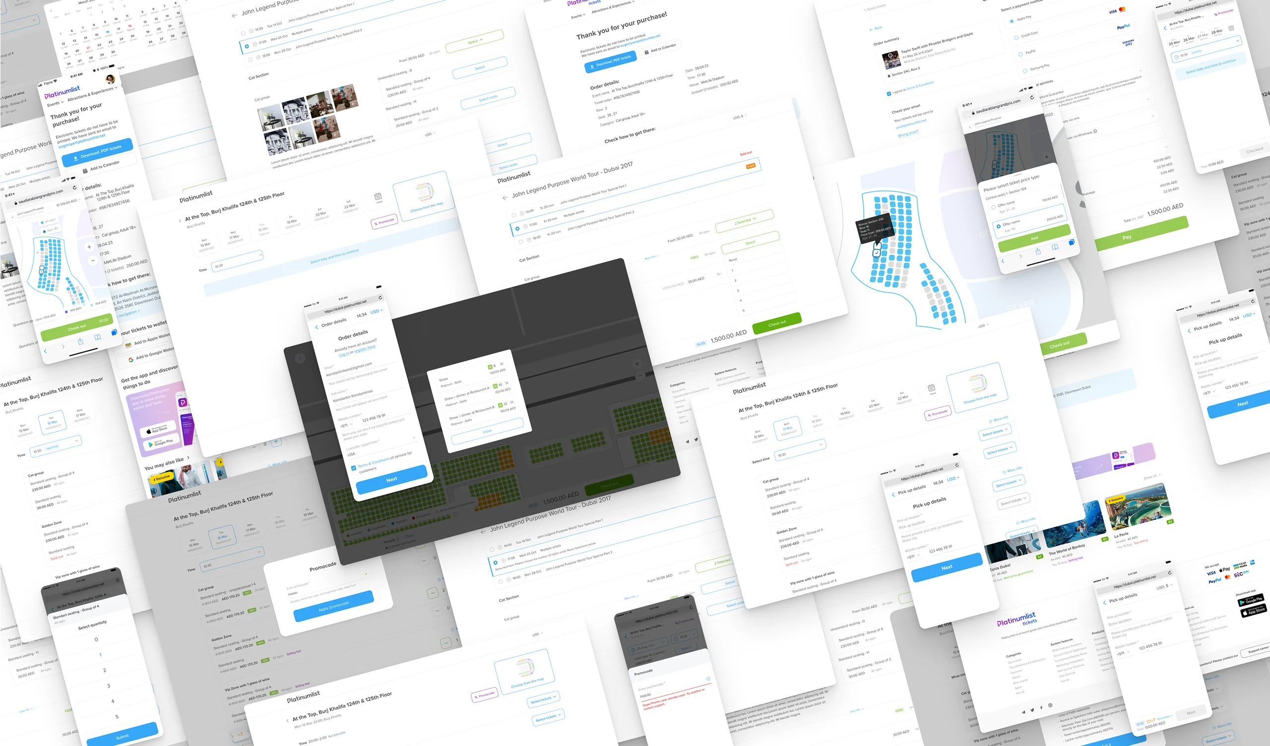
The Challenge
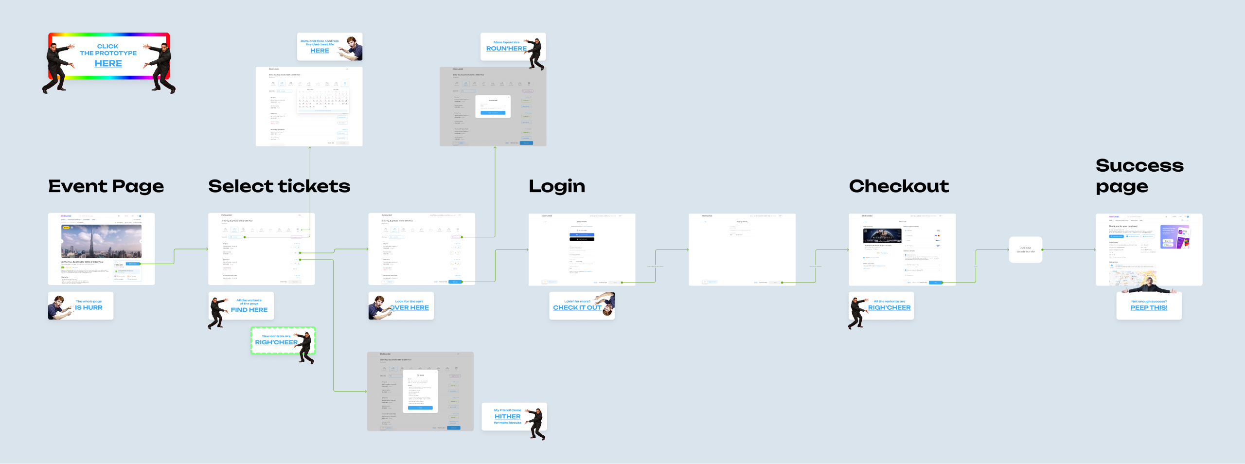
When I joined Platinumlist, my first big project was to fix the ticket purchase funnel. The team already sensed something was off and had started exploring some early fixes. My job was to dig into the experience, spot the pain points, and come up with a better plan.
What I didn’t expect was just how massive the funnel was — from the event page all the way to the final success screen. But the most complex part? Ticket selection. That’s where this case study mostly focuses.
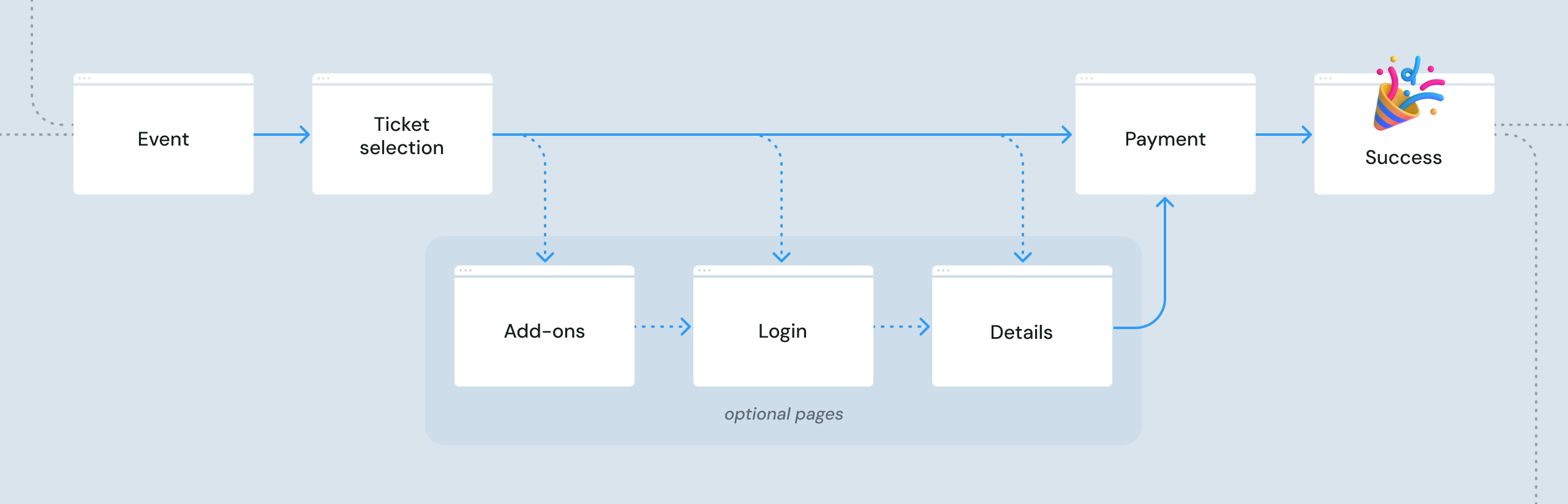
The ticket selection screen was the biggest, messiest part of the whole platform. Tons of variations, edge cases, and legacy code—and no one could tell you all the ways it could behave.
What We Had
I kicked things off by breaking down the current flow. Internally, we split events into two main types: "concerts" (like live shows, festivals, temporary exhibitions) and "attractions" (ongoing stuff like safaris, museums, theaters, etc.).
From there, it gets complicated fast. Some events don’t need a schedule at all, some have multiple sessions per day, some use seat maps, others don’t, but some may need both for the same event and many mix and match ticket types like family, kids, or VIP, etc.
Plus, we had a ton of legacy logic and one-off requests from organizers — many of which contradicted each other.
I gathered all the use cases I could find, mapped out the pain points, and sat down with the team to prioritize: what’s quick to fix, what needs more dev effort, and what’s still too unclear to tackle?
The seat map flow was by far the trickiest because of all the old code behind it. So we decided to go step by step—start with smaller fixes, track metrics, and build momentum.
Iteration 1.0: Quick Wins
/ Sept–Oct 2023
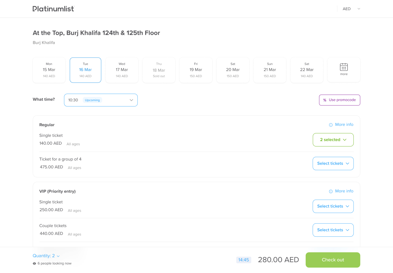
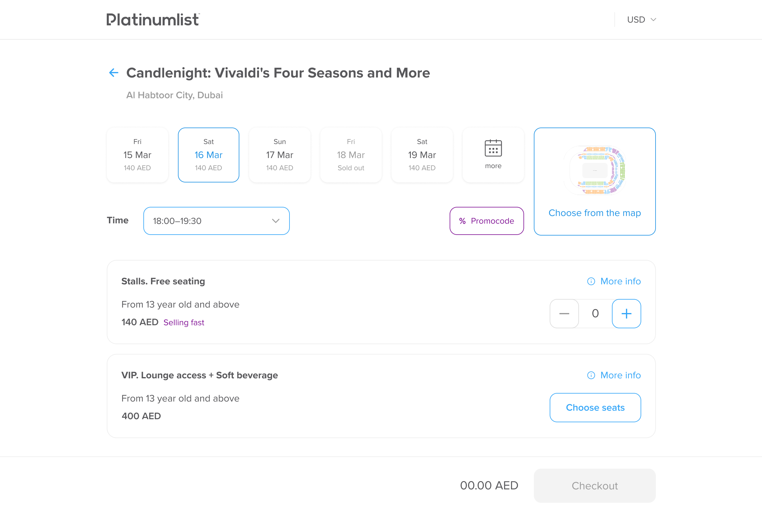
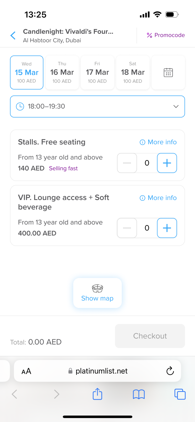
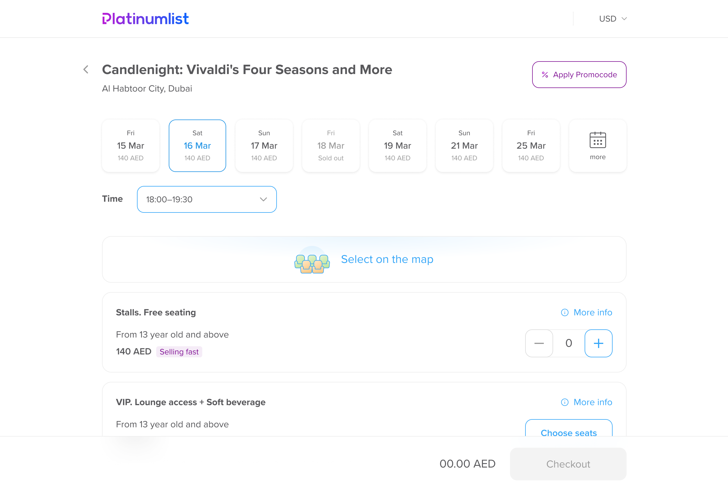
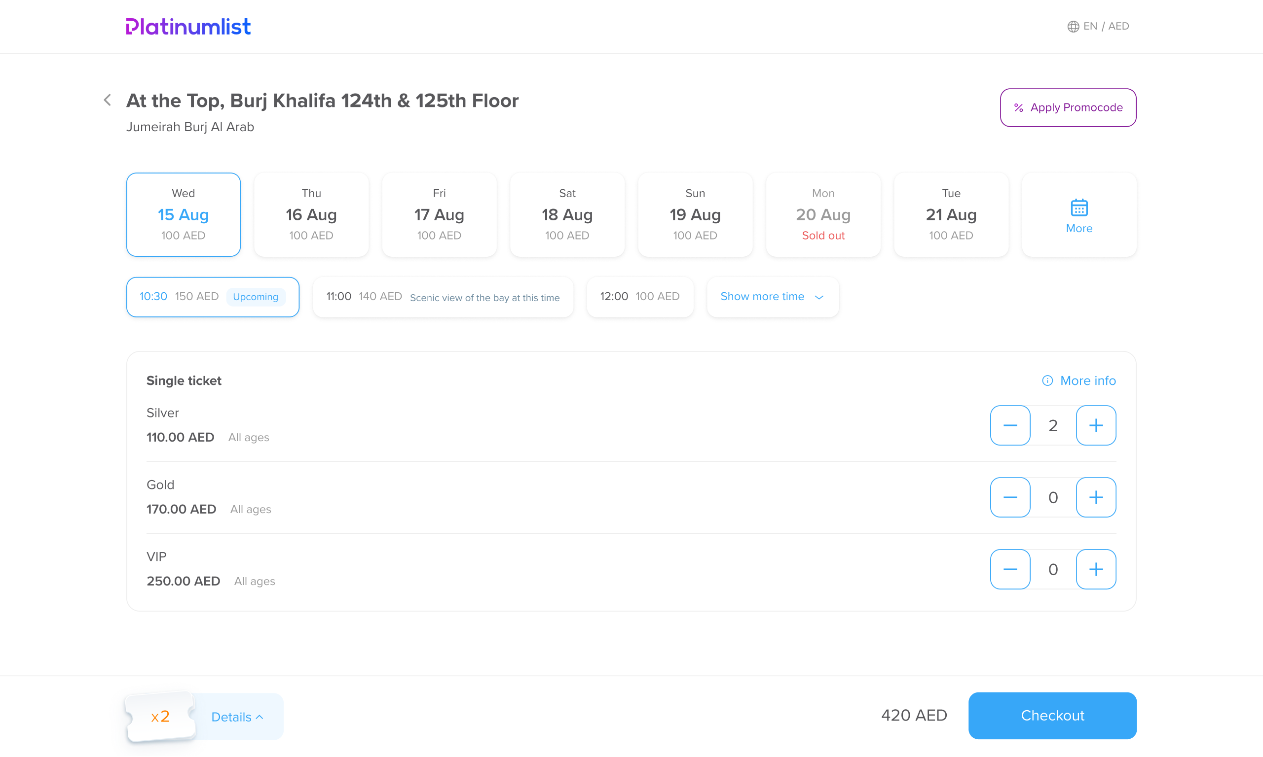
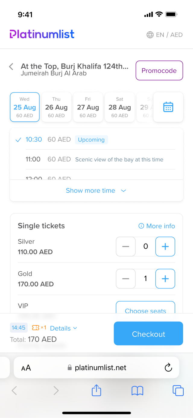
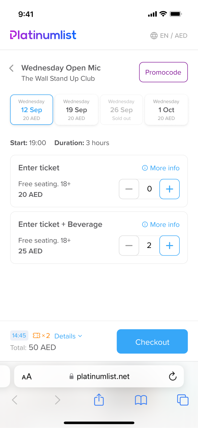
The first thing I tackled was the ticket selector for events without a seat map. The original version used a dropdown. I pitched switching to an e-commerce-style counter instead.


The dropdown made technical sense — especially for high-demand events — because it reserved tickets immediately. But from a UX point of view, it was clunky. It took more clicks, couldn’t be used with the keyboard, and just felt off.
I reworked the logic so counters could still support backend reservations, added keyboard support, and built in smart defaults for high-quantity use cases.
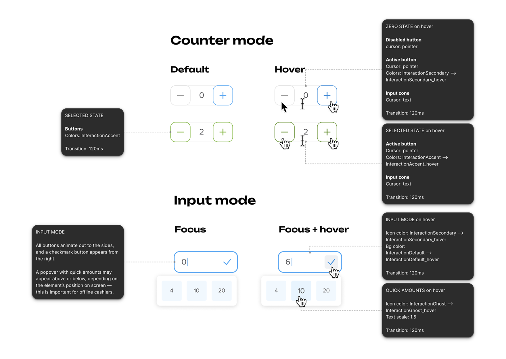
To make it feel polished, I added subtle micro-animations to give feedback and keep the interaction feeling alive.
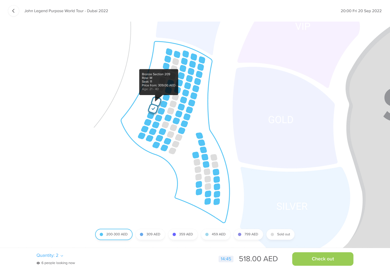
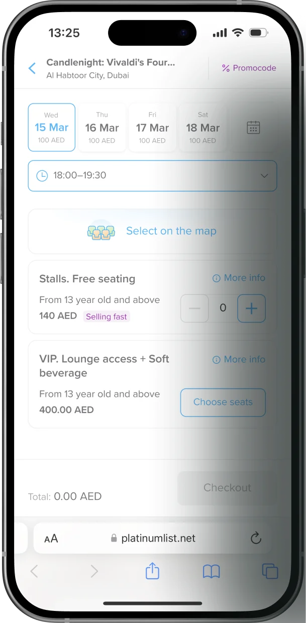
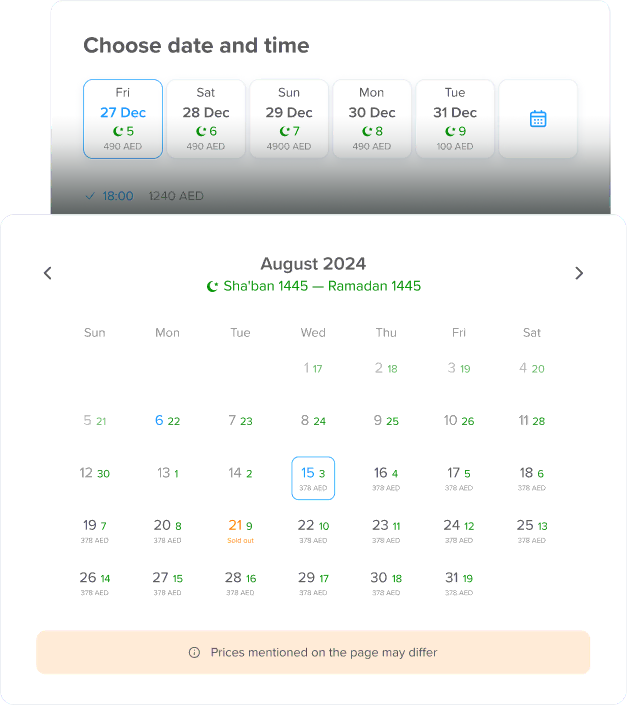
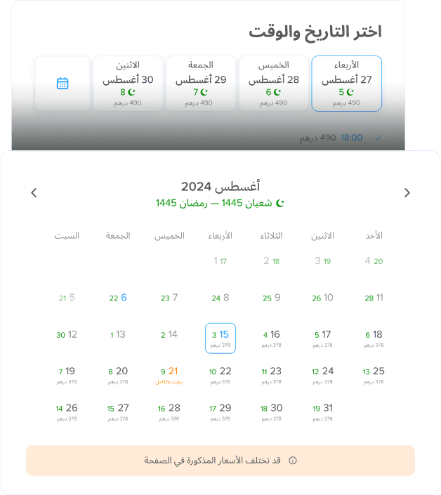
Next up: events with both a schedule and a seat map. Originally, users landed on a list view—not the map, because there was impossible to choose date and time.
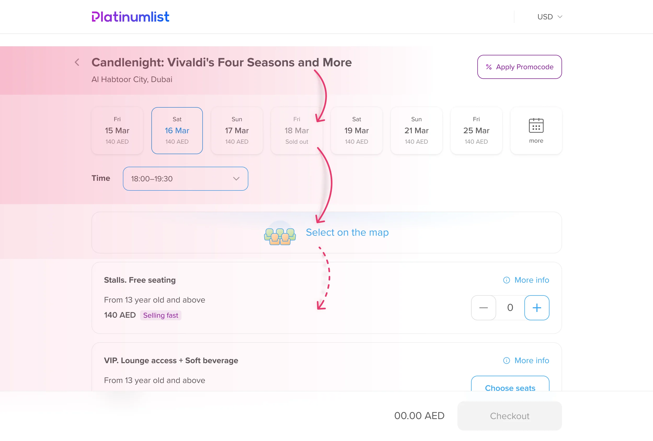
We couldn’t change the architecture right away, so I moved the "Go to Map" button to a more obvious place, so it became the natural next step after choosing a date.
That small tweak made a big difference — users now went from date selection straight to the map, and only used the list view if they really wanted to.
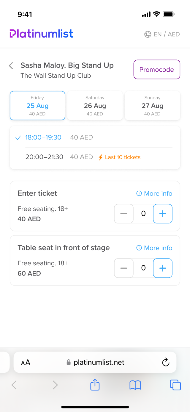
We also didn’t have a proper mini-cart across the funnel. I designed a lightweight, always-visible version that adapted slightly at each step with a smooth animation on the top of that.
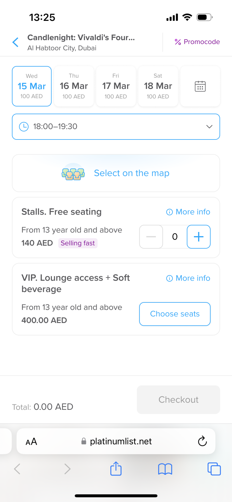
Moreover I fixed various little things throughout the whole tunnel, refreshed the success page, created several prototypes, and — for the first time in the company —built full responsive designs for all screen sizes.
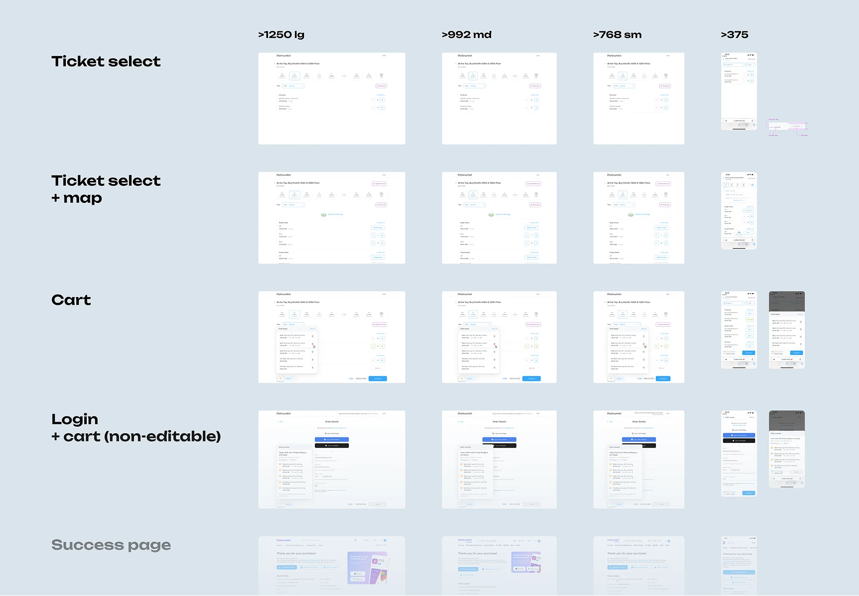
To wrap up this phase, I documented the full funnel and shared a clickable map of all sections, along with ideas for what to do next.
These small tweaks alone led to a 10% boost in purchase conversion.
Iteration 1.2: Schedule Resceduled
/ Nov–Dec 2023
The date selection still felt bulky — especially on mobile. I designed a cleaner version with responsive date chips that scrolled horizontally when needed, replaced dropdowns with a simple list of time slots, and gave the calendar UI a refresh.
Stakeholders were excited, but just as we were about to start implementation, priorities shifted and the team moved to a different project. I didn’t save the visuals, but many of the ideas fed into the next iteration.
Iteration 2: Rethinking
/ Summer 2024
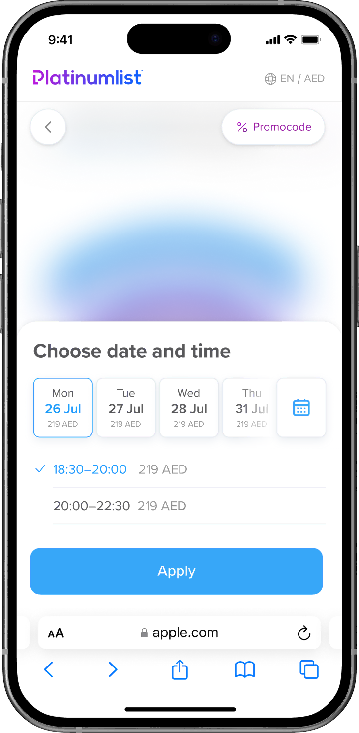
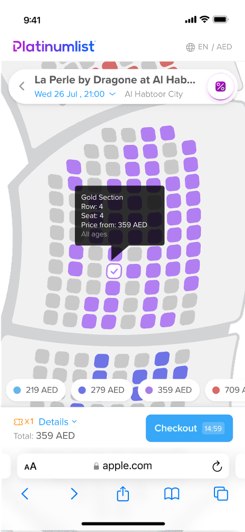
I was really exited when we finally had time to tackle the map-based flow! The issue was the same: if an event had multiple dates or times, we couldn’t send users straight to the seat map. Instead, they had to go through a confusing list view first, which was described before.
I looked at how competitors handled this and brainstormed how we could adapt. We couldn’t skip date selection, but we could make it feel seamless.
So I mocked up a popup that appeared on top of the map. The user would land directly on the map, but with a light overlay prompting them to pick a date and time.
Why it worked better:
- We got rid of the intermediate page — users always saw the map first.
- Date/time selection became much faster and easier, especially on mobile where the interaction was thumb-friendly.
The stakeholders loved the new concept, so I continued working on more cases. And as I worked through more scenarios, I realized this pattern could work everywhere, even for list-based events.
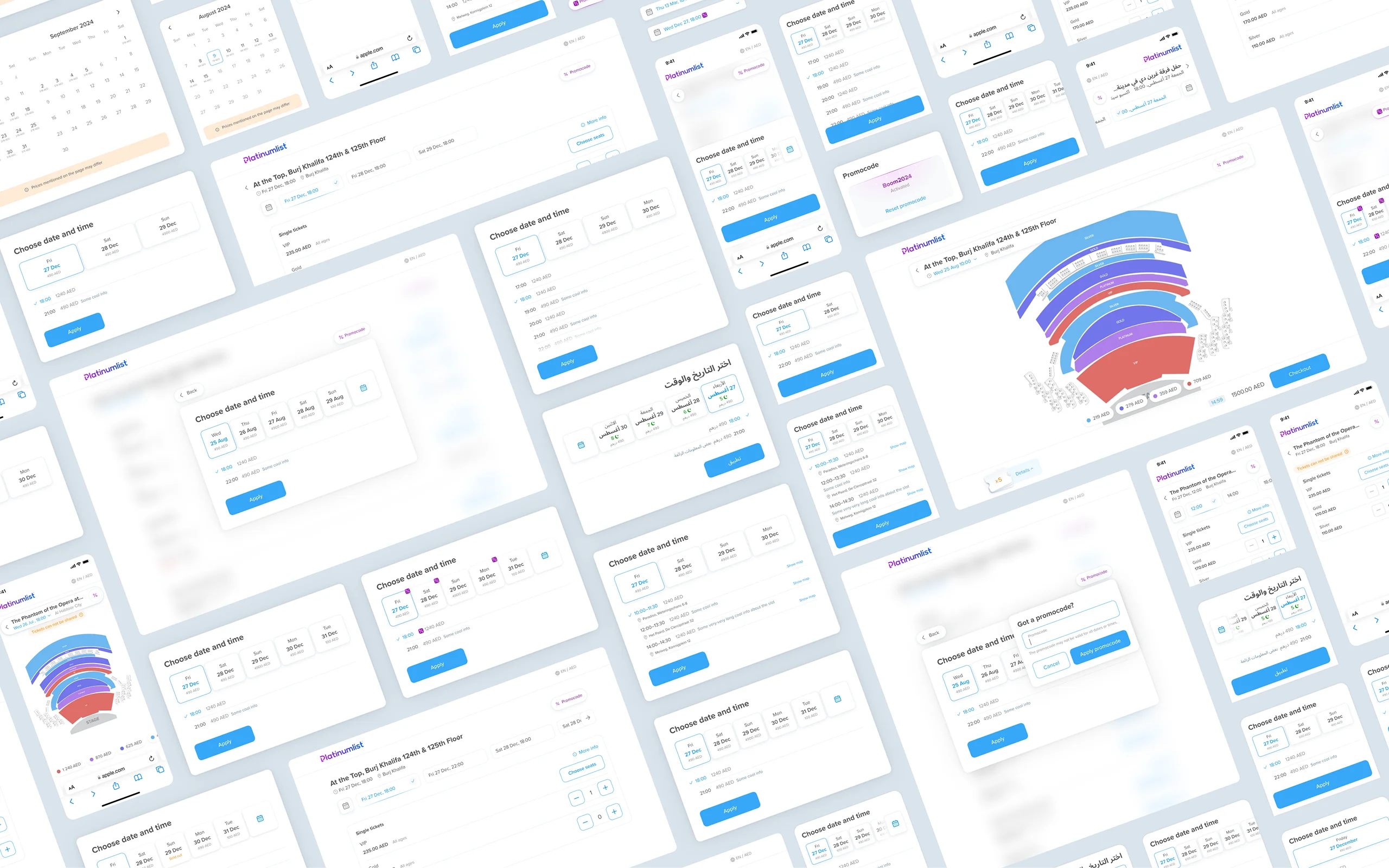
To confirm my ideas I built out a few new prototypes with different scenarios which we tested on several rounds for user research.
Feedback was clear: the new flow was way easier to understand. After polishing some edge cases, I finalized everything.
When it was the promo code's turn, I added a playful little interaction to make it feel more rewarding.
Another important piece was the long-requested lunar calendar. I started working on it during the Iteration 1.2 before the Ramadan 2024 and later refined it into a clean, localized component that worked for both English and Arabic users.
Ideas for the Future
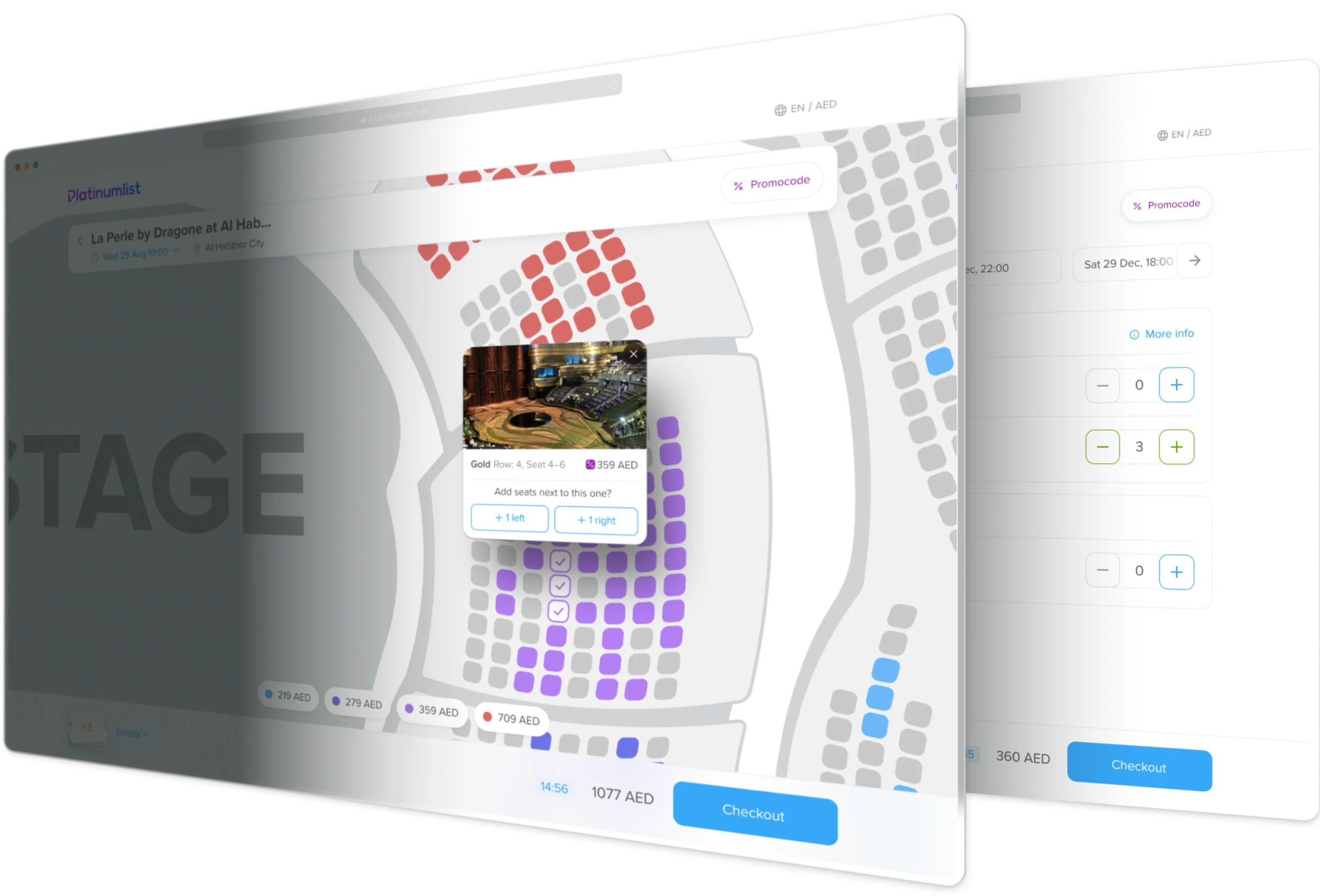
While improving the seat map page experience, we realized that seat selection itself could be much more helpful. One key insight: users decide easier when they see what exactly they’re buying — including the view from their seat.
That’s when the idea came up: enrich the seat tooltips with photos of the view from each section.
Looking deeper into analytics, we noticed that users often buy multiple seats at once — at least two, and sometimes more for family events. But on mobile, selecting small seats one by one might be frustrating. So I explored quick-select "neighboring seats" buttons to simplify the process.
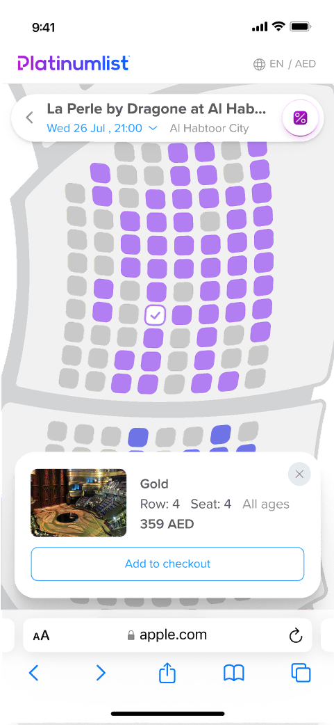
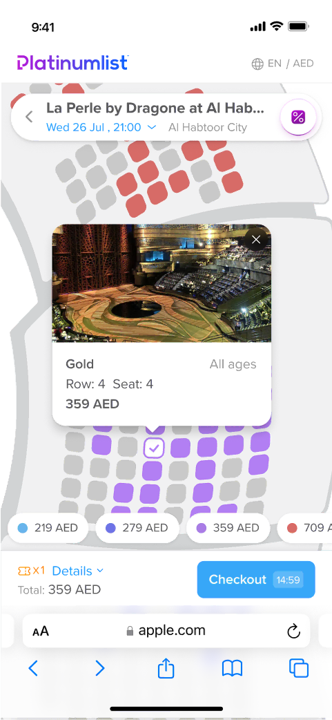
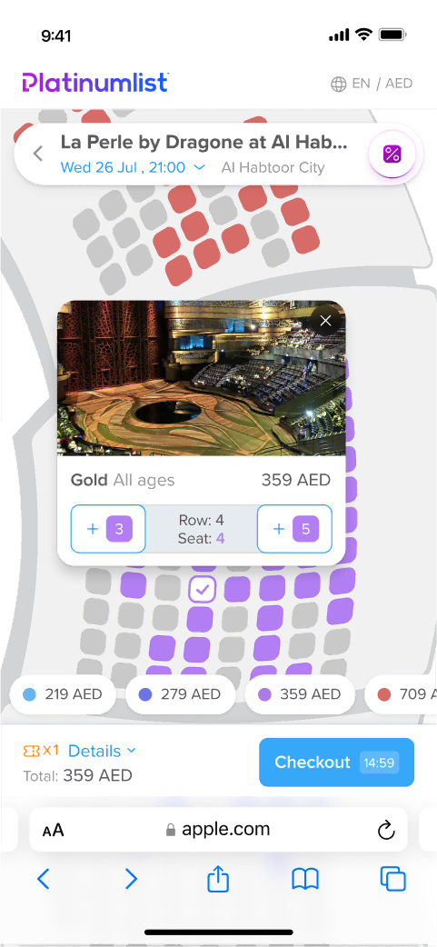
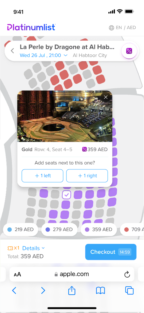
I explored a few tooltip layout options and initially believed the fourth version had promise, built a quick prototype, and shared it with the team. They liked it, but I wanted to test it further. In a round of quick user testing, the “neighboring seat” buttons confused people — they felt too heavy and unclear.
I took another pass: I simplified the design, added clearer microstates, and tested again. This time, users got it—and liked it.
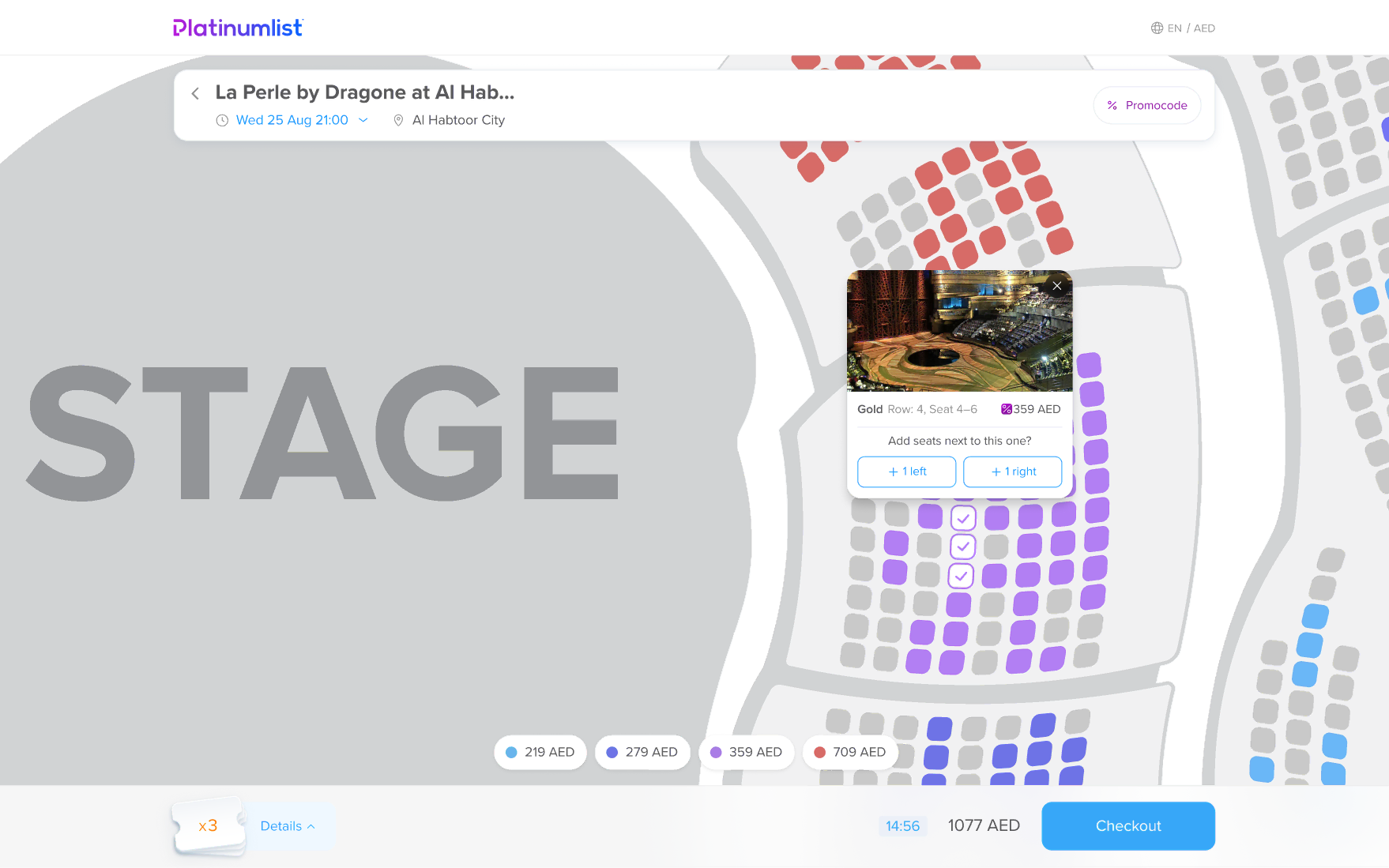
Everyone, including stakeholders, loved the new tooltip concept. But it also came with a big technical ask: we’d need to photograph views from every section in lots of venues. So we put the idea on hold until we’re ready to revamp the seat maps themselves, which also need a refresh.
Results & Impact
As a result I streamlined the entire ticket flow keeping the same core steps and just making them clearer, faster, and easier by sticking to "one screen = one task."
A/B tests showed:
-
+72%
Increase in purchase conversion — from 4.4% to 7.6%.
-
-20%
Reduction in time to purchase the tickets
There’s still more to improve. The seat maps themselves are outdated and could definitely use a full redesign. But that’s a whole other project...